Local Lettermarks
Project Details
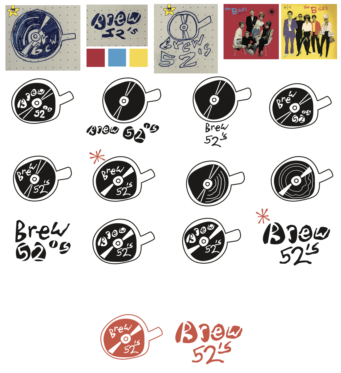
For this project, I was tasked to create a brand using inspiration from local typography and lettermarks.
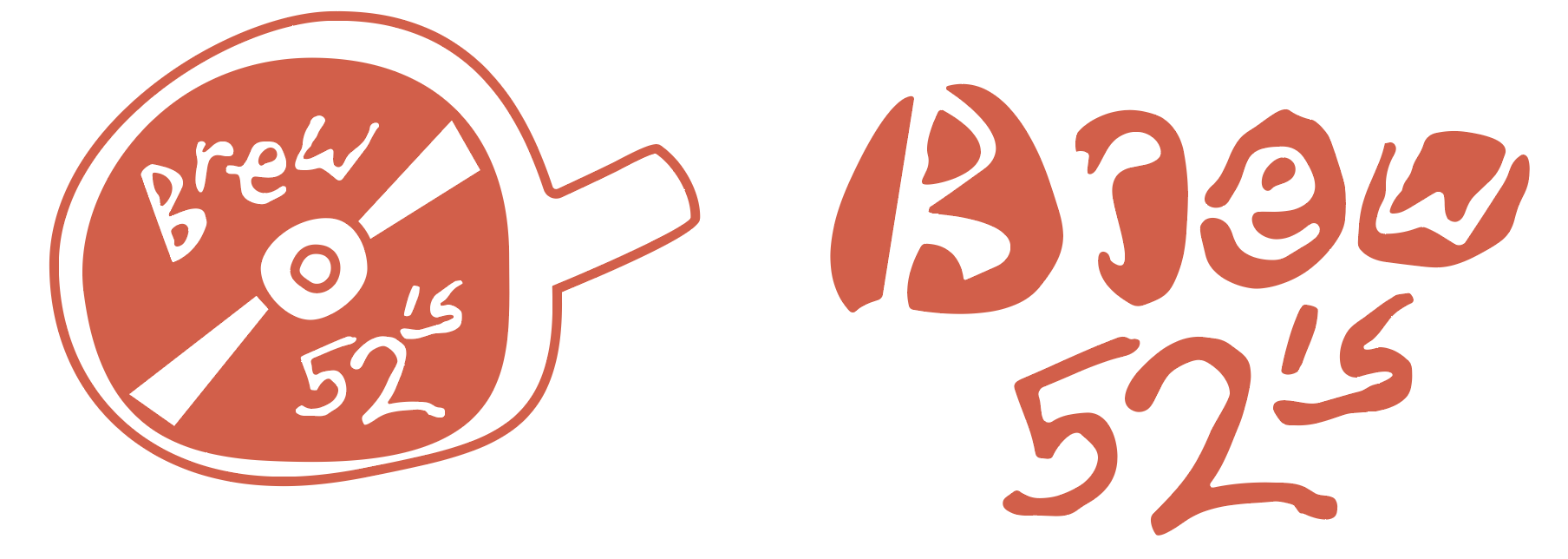
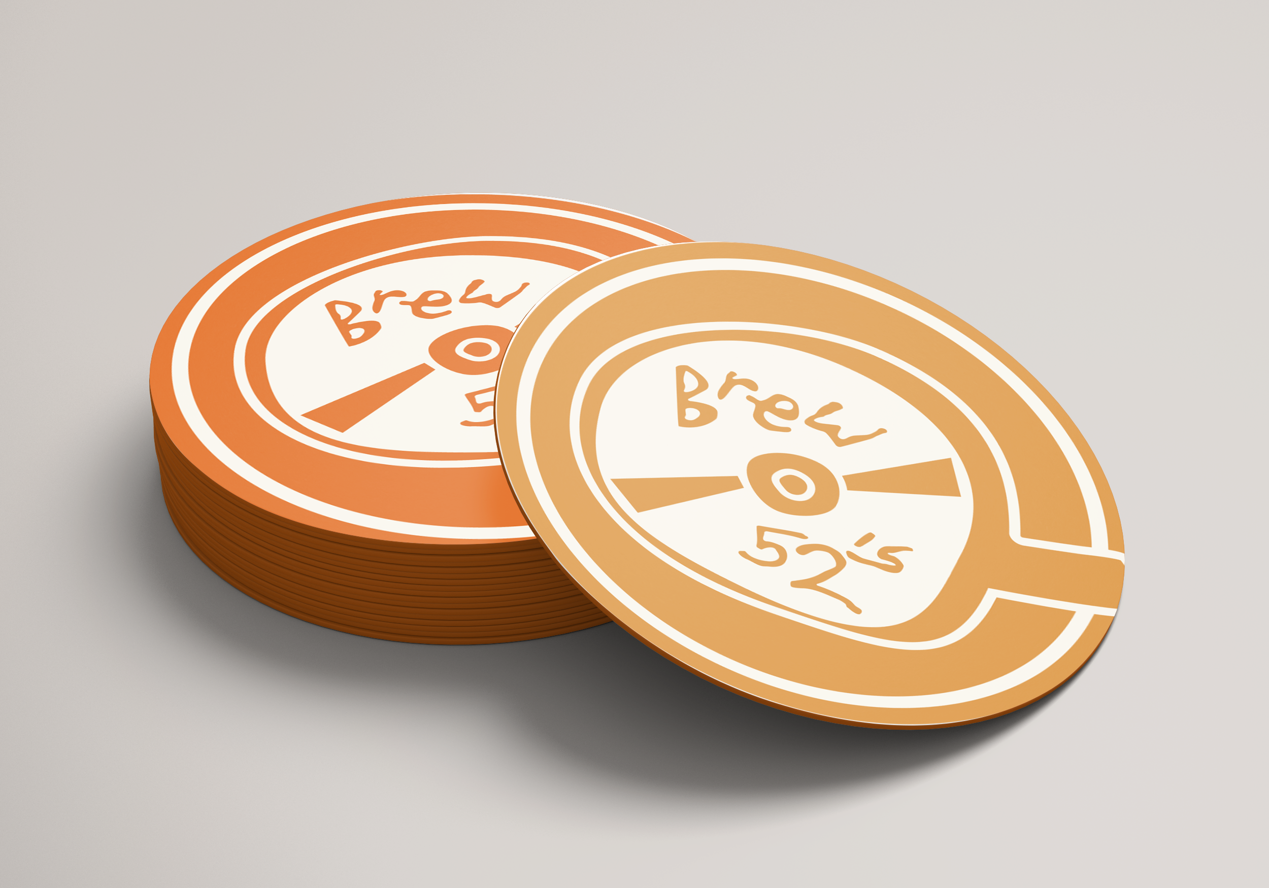
Inspired by the iconic 1976 New Wave band The B-52’s, Brew 52’s is the result of a CD store and café blended together. Brew 52’s is designed to bring people together through food, music, and a good jive. Referencing the shape of coffee beans, playful spillages, and the vibrant colors sampled on The B-52’s album covers, this space is a tribute to the love of music and the artistry of the New Wave movement that defined the ’80s and beyond.